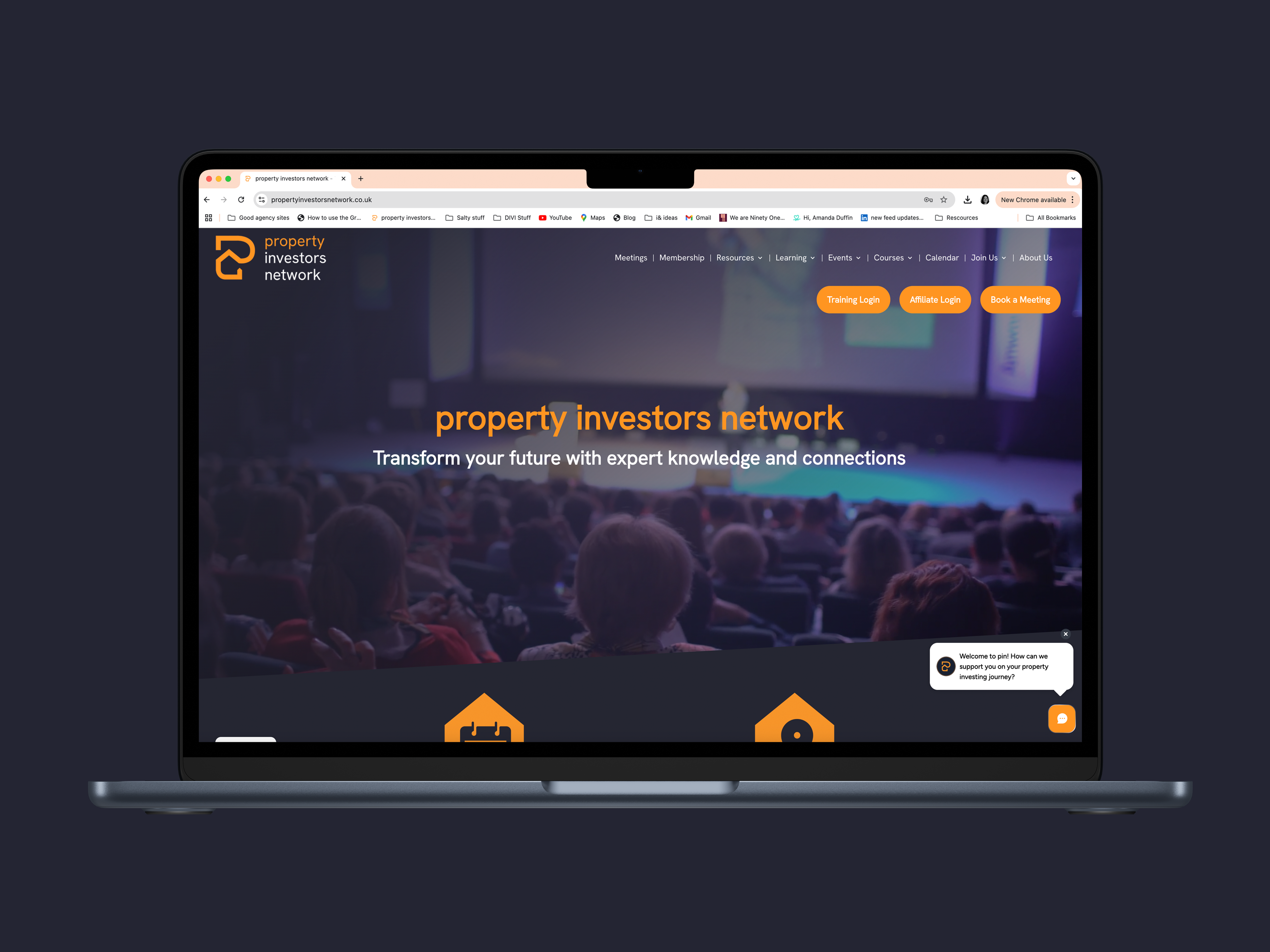
Client: property investors network
Work: Brand development. Website build. Brand world design.
When property investors network (pin) approached me, they were ready for a transformation. With a long-standing reputation and a wide-reaching community, the brand had become diluted over time. Together, we went back to the beginning, reshaping pin from the inside out with a clear, authentic narrative and a modern, cohesive identity.
Through a series of in-depth workshops, we uncovered the heart of the brand: community, empowerment, and the belief that property investment can be a pathway to personal freedom. This led to the creation of the ‘P’ device, a symbol of journey, direction, and growth, combining visual storytelling with a renewed sense of purpose.
The rebrand was shaped by themes of support, connection, and momentum. These ideas came to life through every detail of the new identity, from the visual system to the tone of voice. The result is a confident, inclusive, and future-facing brand that reflects pin’s mission to empower people at every stage of their property journey.


